


Imagining the mobile future app for NatWest and Royal Bank of Scotland.
The NatWest and Royal Bank of Scotland mobile banking apps were in need of a redesign, both from a ux and visual perspective because of the recent rebrand. With more than 50 new features coming on the roadmap in 2017/18 it was quickly realised that the app’s structure as it currently stood would need a rethink if it was to continue to keep its high regard and its 5 star app store status.
Project objectives
Rethink the overall experience to bring it in line with customers expectations of what a modern banking app should be in todays mobile landscape. Make the different ways to make payments and move money simple, intuitive and frictionless. Increase customer engagement in the use of the bank’s products and services. Enhance feature discoverability and help demystify everyday banking. Make banking products more personalised and seamlessly integrate them in the overall everyday banking service rather than taking a hard sell approach.
The approach
Research - we looked at the existing journeys through the eyes of the customer, identifying key consumer pain points. We conducted some extensive research around the banking industry, mobile trends and behavioural economics to identify opportunities. We researched both in category competitors and out of category innovators to see where our USP could lie. What could we do that no one else is doing? Where could we make a real positive impact on customer’s lives?

Co-creation - We ran co-creation workshops with business stakeholders, technology and design to translate the insights from the research sessions into clear problem statements that we could try to solve.
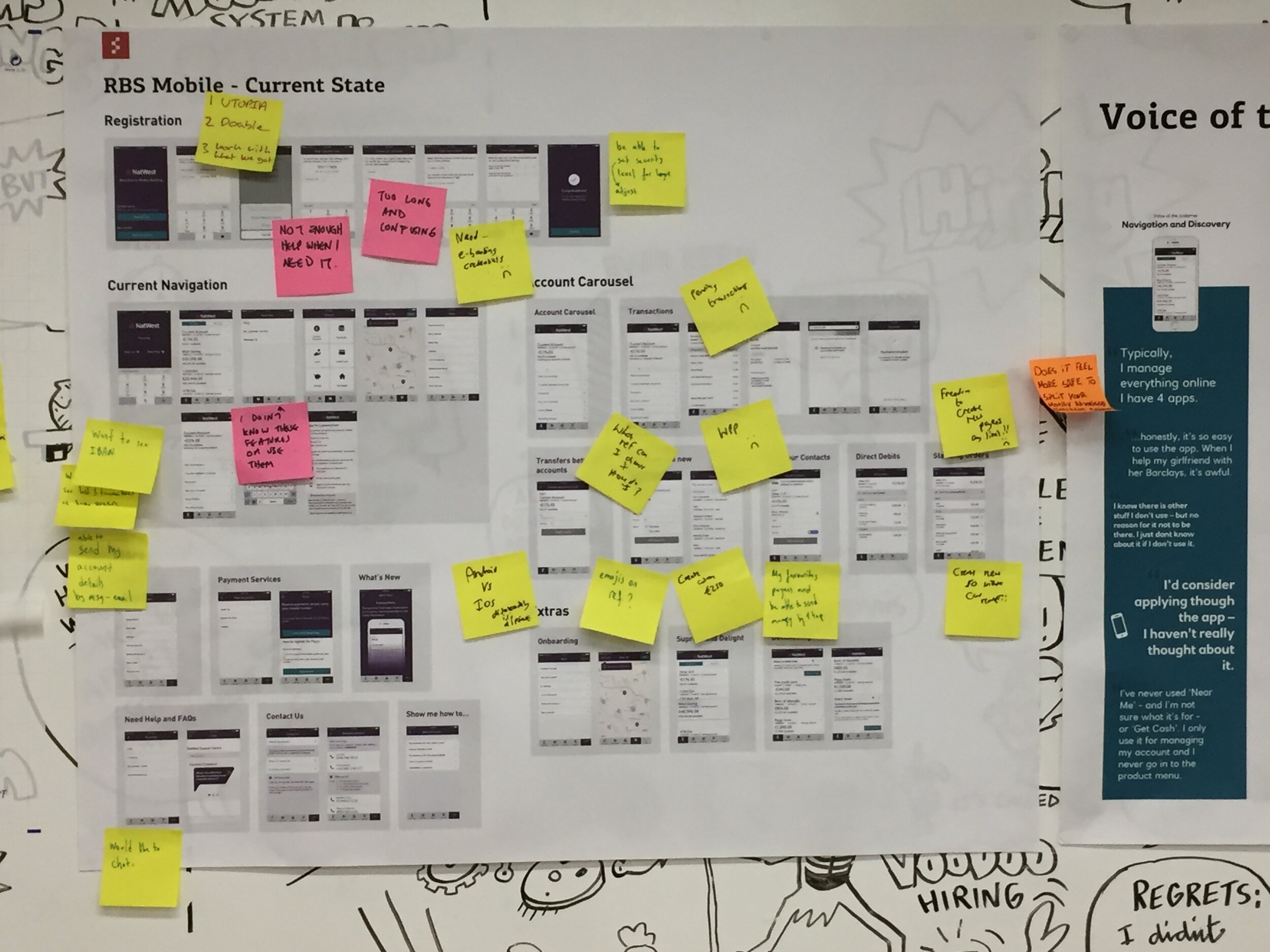
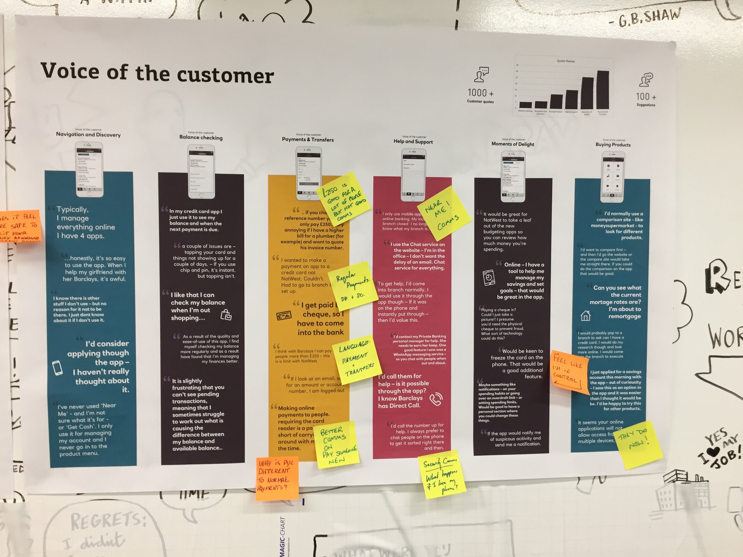
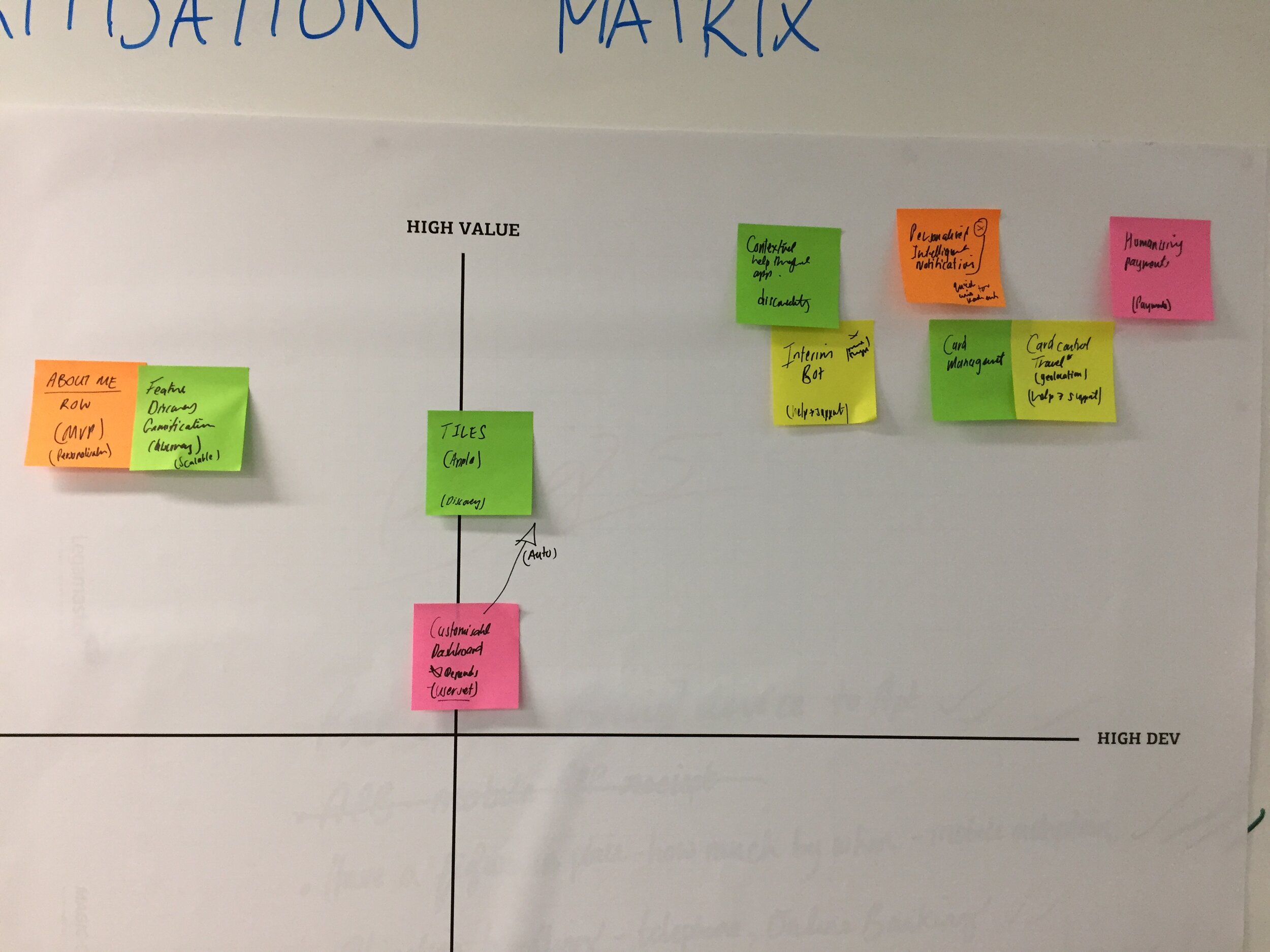
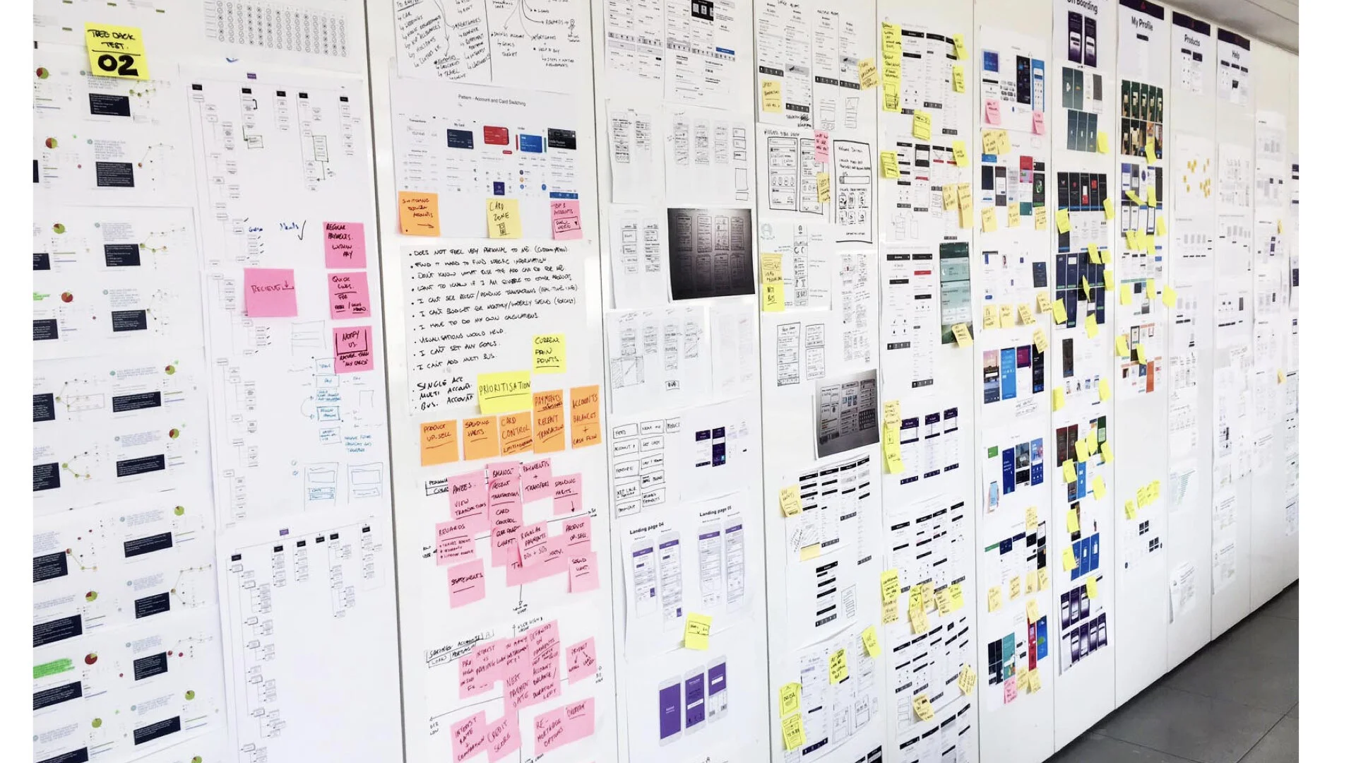
Iterative design - From the co-creation workshops we created clear themes that we could focus on in a set of design sprints. Within each theme we already had a prioritised list of pain points that we would use to ideate from. The design sprints took the form of 2 week sprints. We built quick prototypes and tested them with customers using various methods and rolled these insights into an ever evolving design solution.


Design principles
One of the methods we used to keep us focussed on our goals was to define some experience principles which we could use to validate all of our designs against. Design principles can be a bit fluffy in many cases, most companies don’t really get granular enough and make them practical that they can be actually used. For us we felt these principles were usable and useful:
Help me discover useful features
Make my frequent tasks frictionless
Educate me in context
Delight me with relevance
Give me answers before I ask
How we tested and validated
For testing labelling and navigation we ran a number of tests using Treejack from Optimal Workshop. Treejack is a great tool for testing navigation and way finding to learn where people would go to find certain things or do certain tasks. We used InVision click thru prototypes and performed Guerrilla testing with them in NatWest branches around London–we chose different branches to get a selection of different types of customers. In the city we had office workers whereas further out in residential areas we could get older customers and full time parents.
Through an external research agency we set up lab tests across the country (Edinburgh, Manchester and London) to make sure we covered the variability of different social economic and cultural factors, this turned out to be a wise move as the insights did differ from place to place.

The results
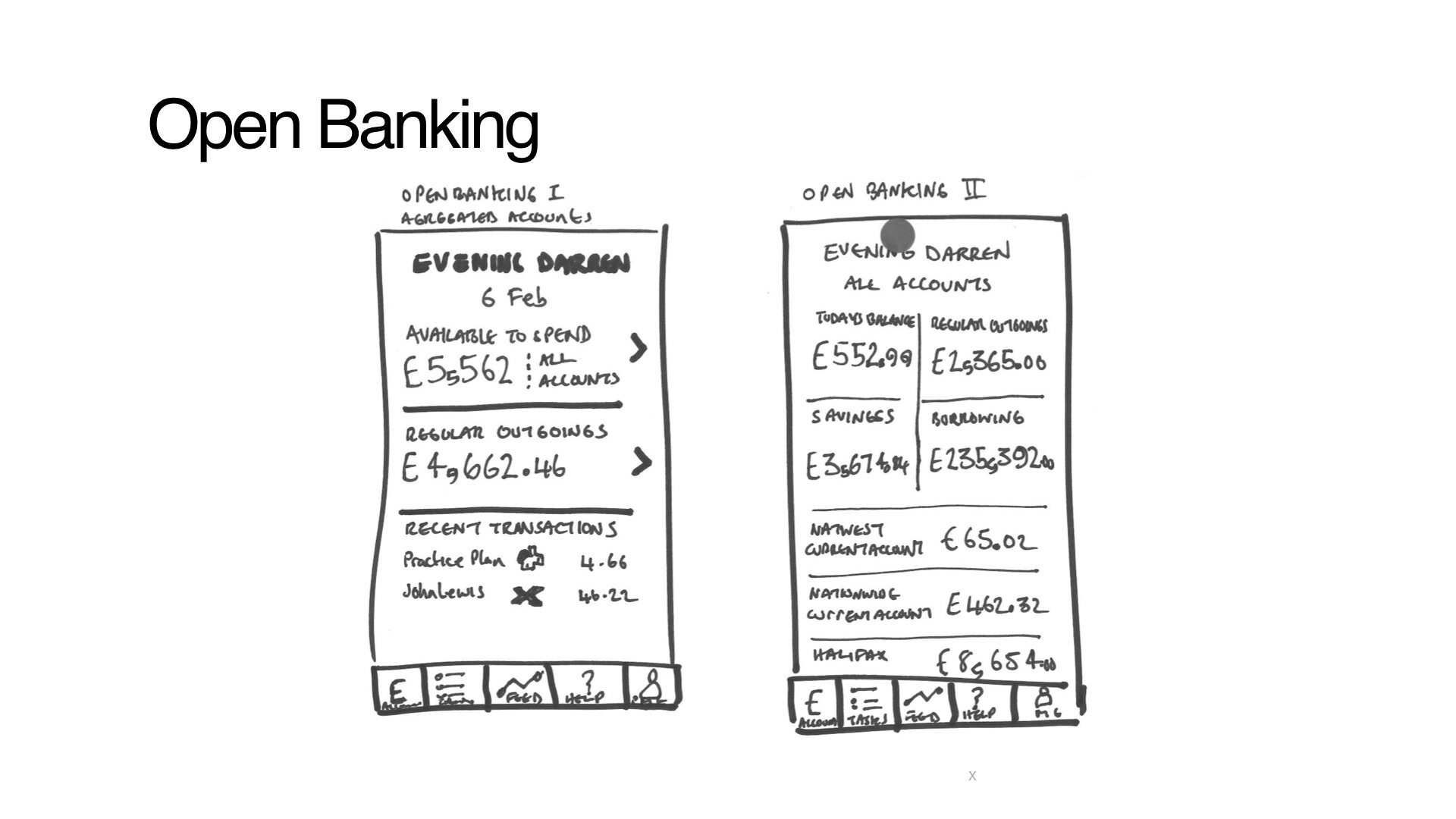
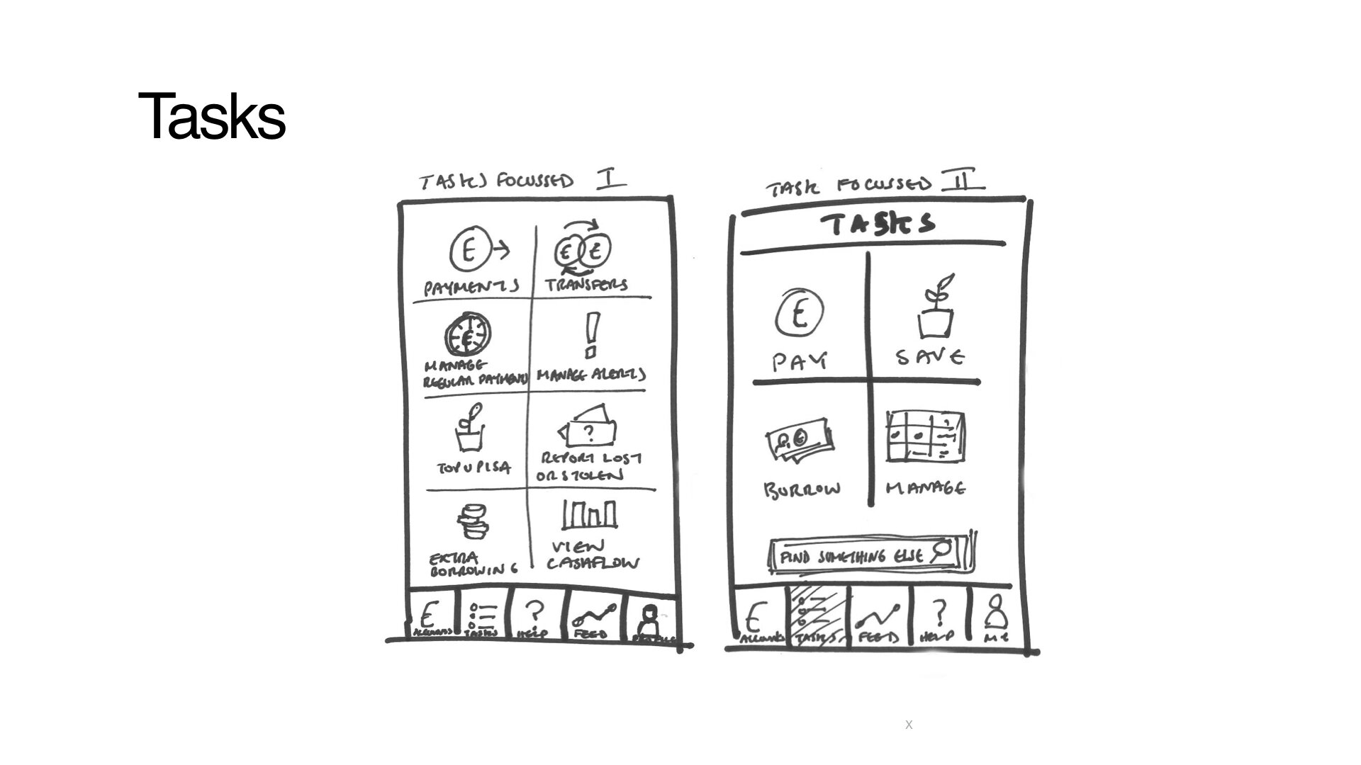
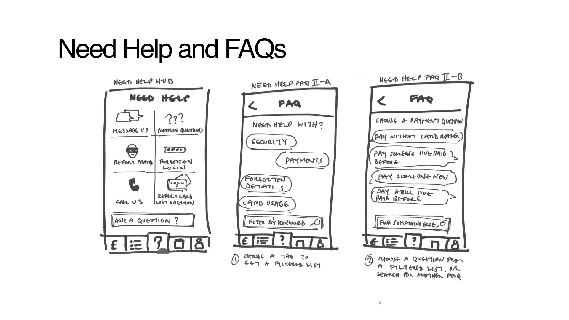
Below are some comparative designs comparing the current app to the new designs.
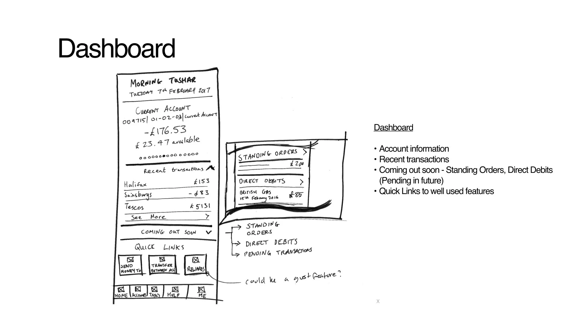
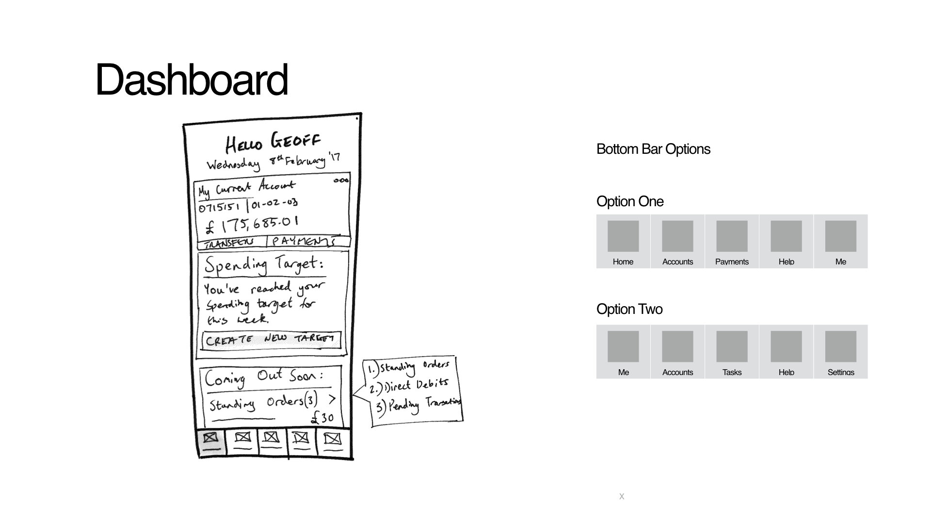
Navigation and Home, current design (left) and new proposed design (right)
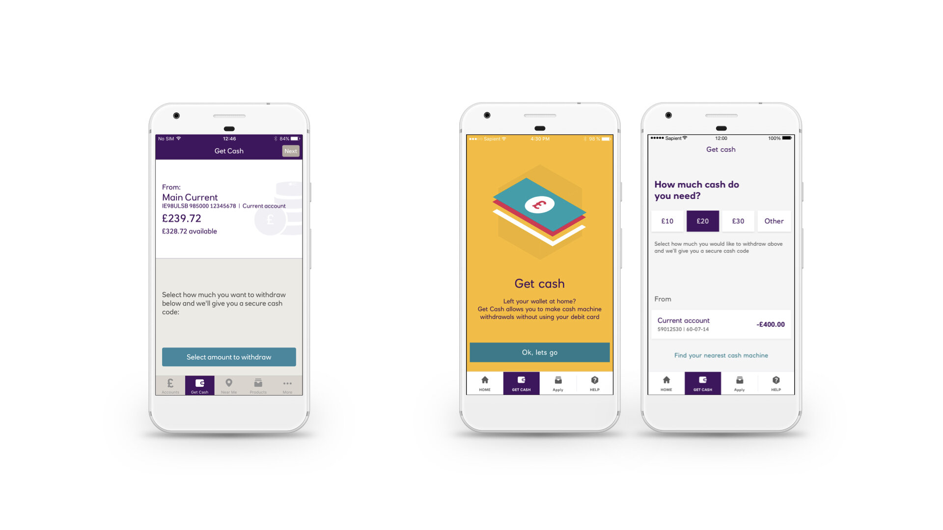
Get cash is a facility to Draw emergency cash in the case where you don’t have your card with you.
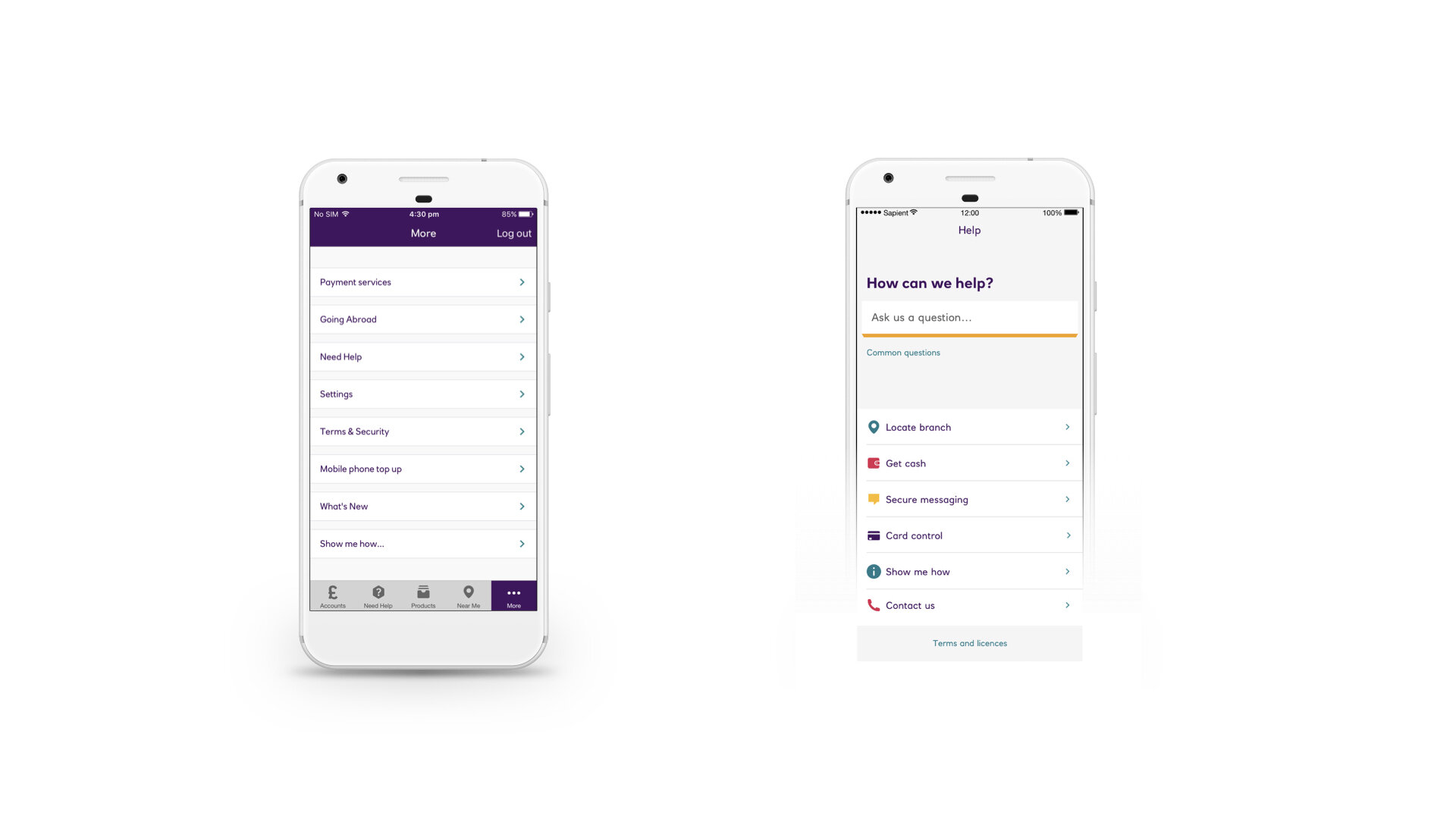
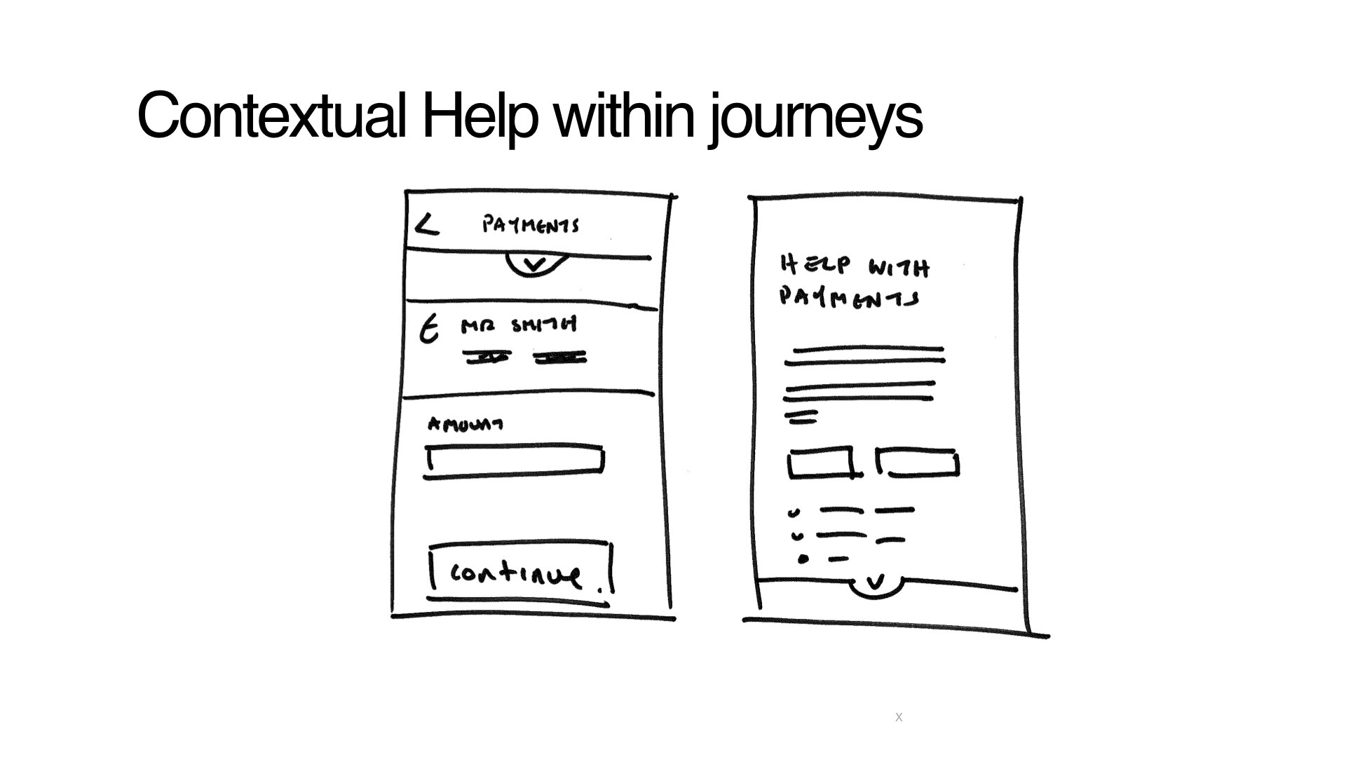
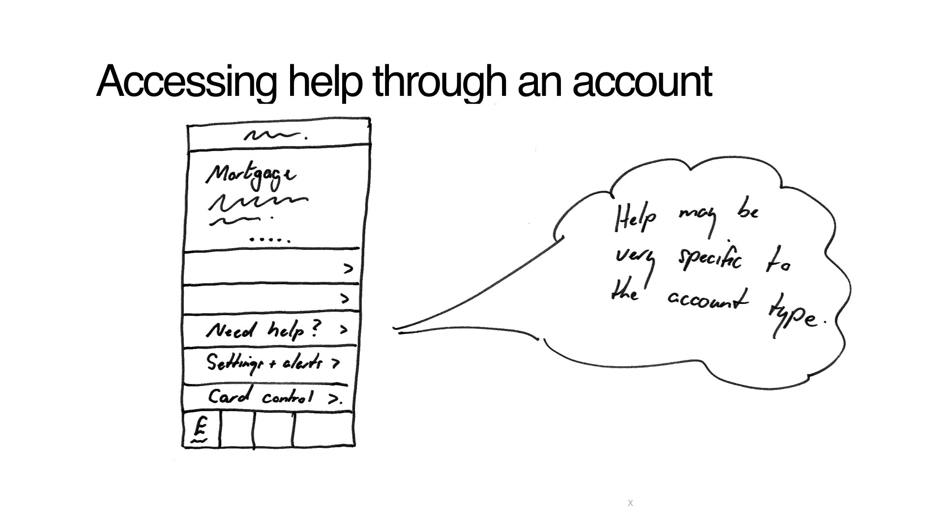
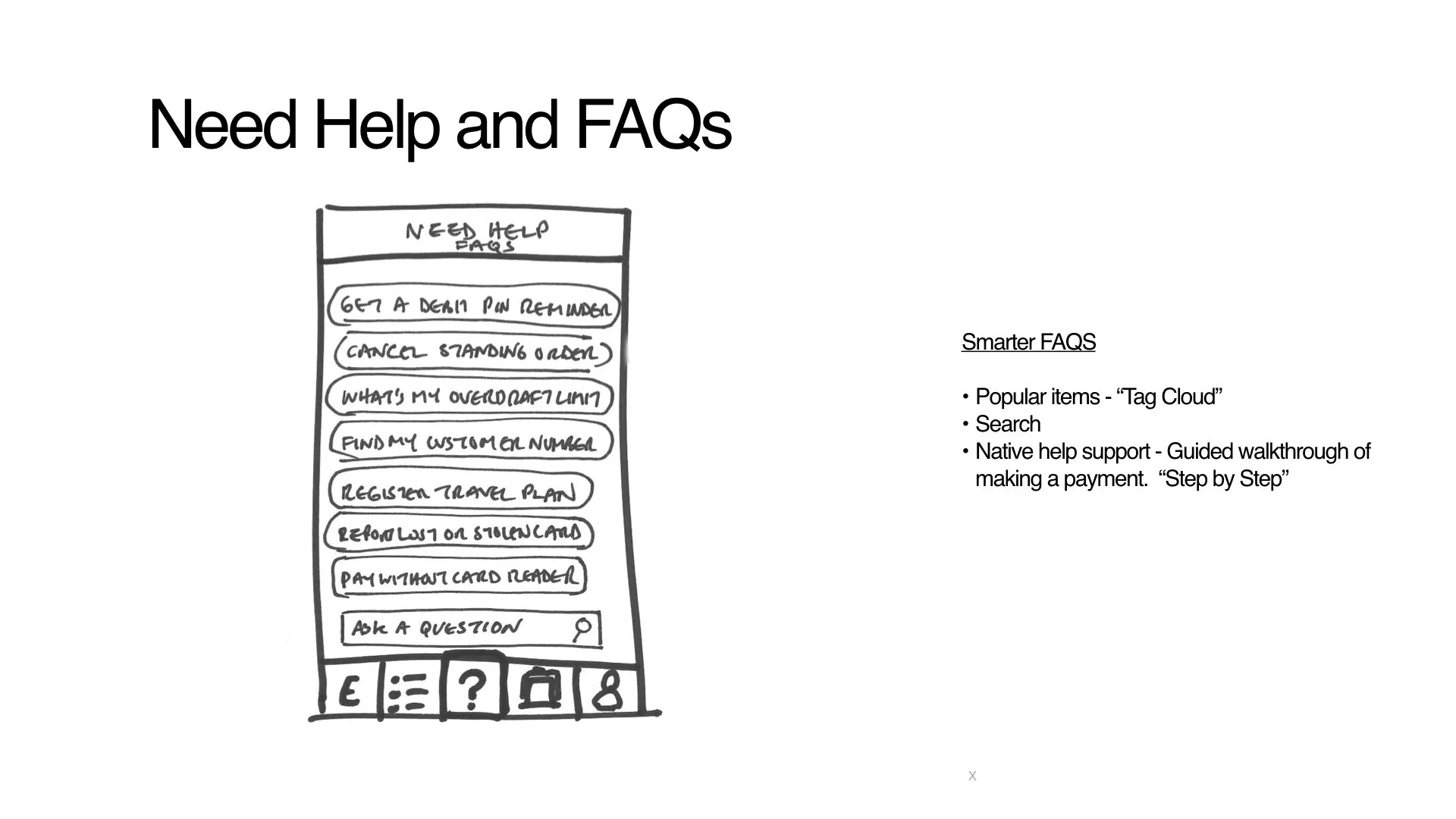
The help centre would a central part of the experience

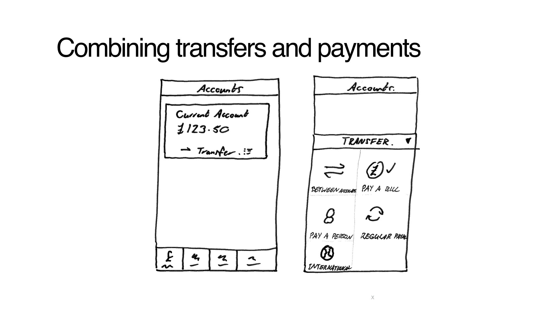
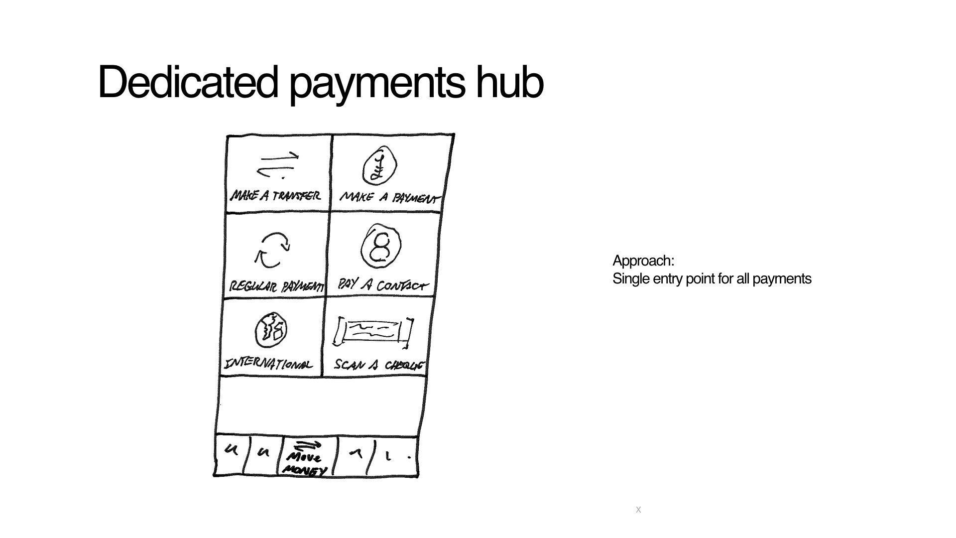
A more fluid payment flow designed to match how people think payments should work
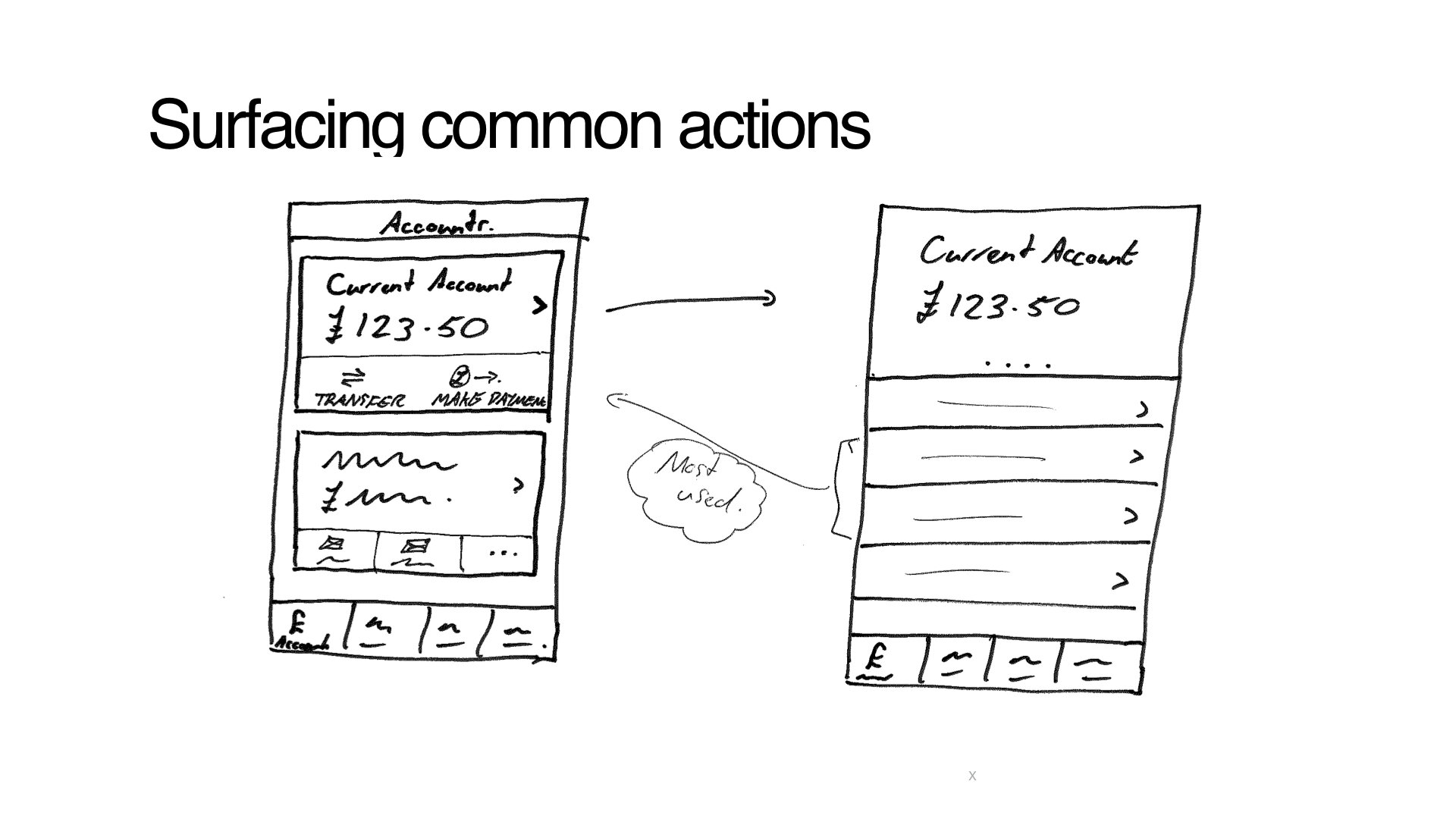
Making frequent tasks frictionless
Contextual help to onboard key features with mobile optimised interaction
A Walk through new NatWest
Below is a video walkthrough of the proposed result. The video was recorded from a real iOS app prototype that we built and used for usability testing.